



As a wedding photographer, I’ve seen just about every color combination you can imagine. From soft pastels to moody jewel tones, from classic whites to bold, unexpected pairings – color has a way of completely transforming a wedding day.
Over the years, I’ve noticed how much your color palette does behind the scenes. It sets the mood. It shapes the energy in a room. And it creates the foundation for all those little moments that make your wedding feel like yours.
If you’re in the early stages of planning, choosing a spring wedding color palette is one of the most exciting (and impactful) places to start. So I’ve pulled together a few of the most beautiful and unique color combinations I’ve come across. These ideas are perfect for couples planning a spring wedding who are looking for something that feels fresh, intentional, and unforgettable.
How to Choose a Spring Wedding Color Palette That Matches Your Style
Choosing the right palette is about more than following trends. The best weddings feel intentional, and that starts with colors that reflect you. Think about the kind of space you’re creating. Is it light and airy? Warm and earthy? Elegant and modern?
Here’s a quick guide to help match your personality and wedding style to a palette that works:
| Wedding Style or Personality | Color Mood That Matches |
| Soft, romantic, elegant | Whisper Pink, Peach Pearl, Morning Mist |
| Bold, confident, creative | Tigerlily, Deep Cobalt, Picante |
| Grounded, nature-inspired | Raw Sienna, Desert Sand, Winter Wheat |
| Modern, minimal, refined | Faded Denim, Desert Sand, Deep Cobalt |
| Whimsical, playful, bright | Mimosa, Faded Denim, Apricot tones |
Once you know the vibe, choose two or three colors as your base. Layer in neutrals, soft textures, and metallic details to create a cohesive, elevated design.
1. Pantone Mimosa + Desert Sand
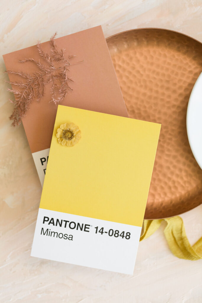
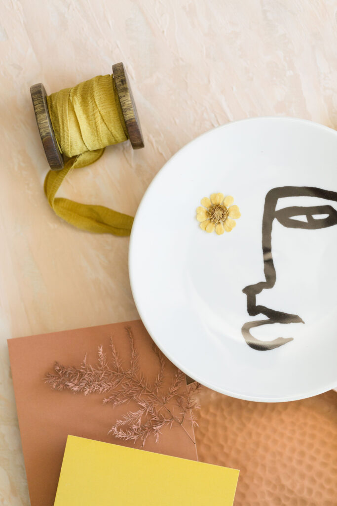
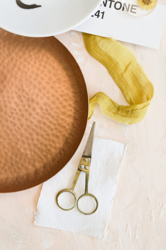
Sun-drenched and joyfully warm
If you want your spring wedding to feel bright, grounded, and full of life, this color combination is for you. Mimosa brings a sense of optimism and light. Desert Sand adds warmth and depth. Together, they create a glowing spring wedding color palette that’s both fresh and refined.
Use it in: amber-toned glassware, golden velvet ribbons, marigold floral installations, and textured table linens in natural earth tones.
2. Pantone Whisper Pink + Faded Denim
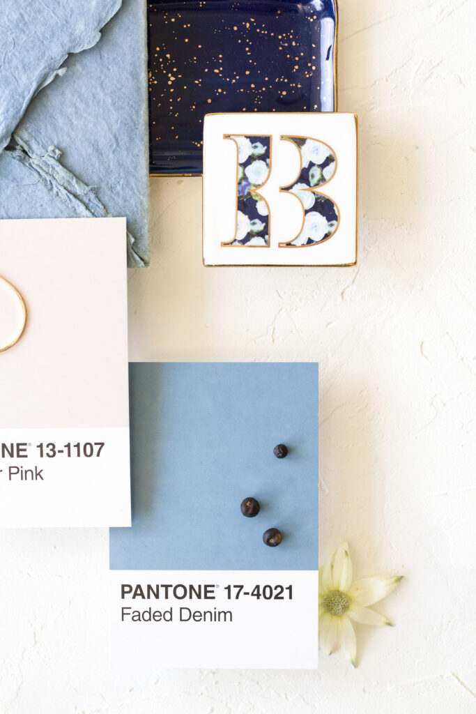
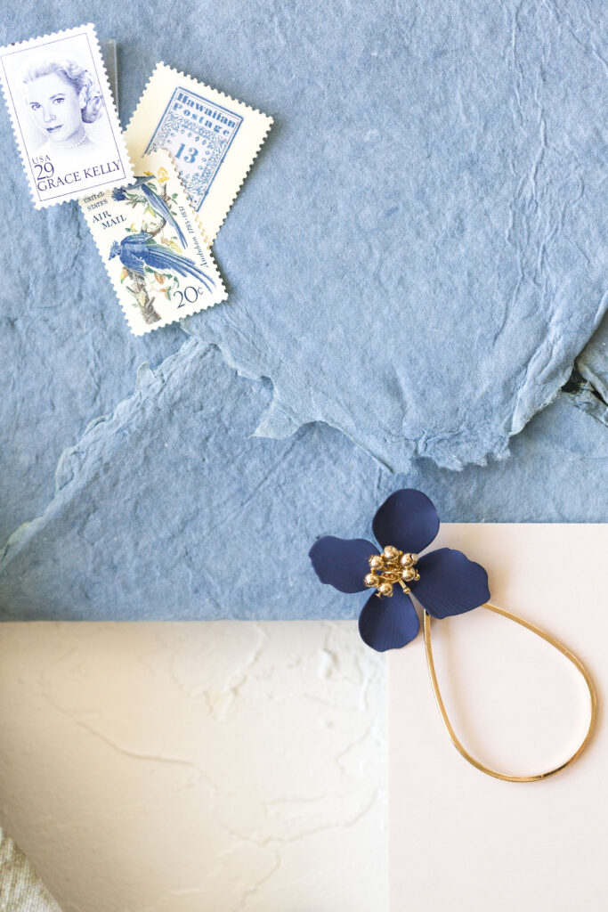
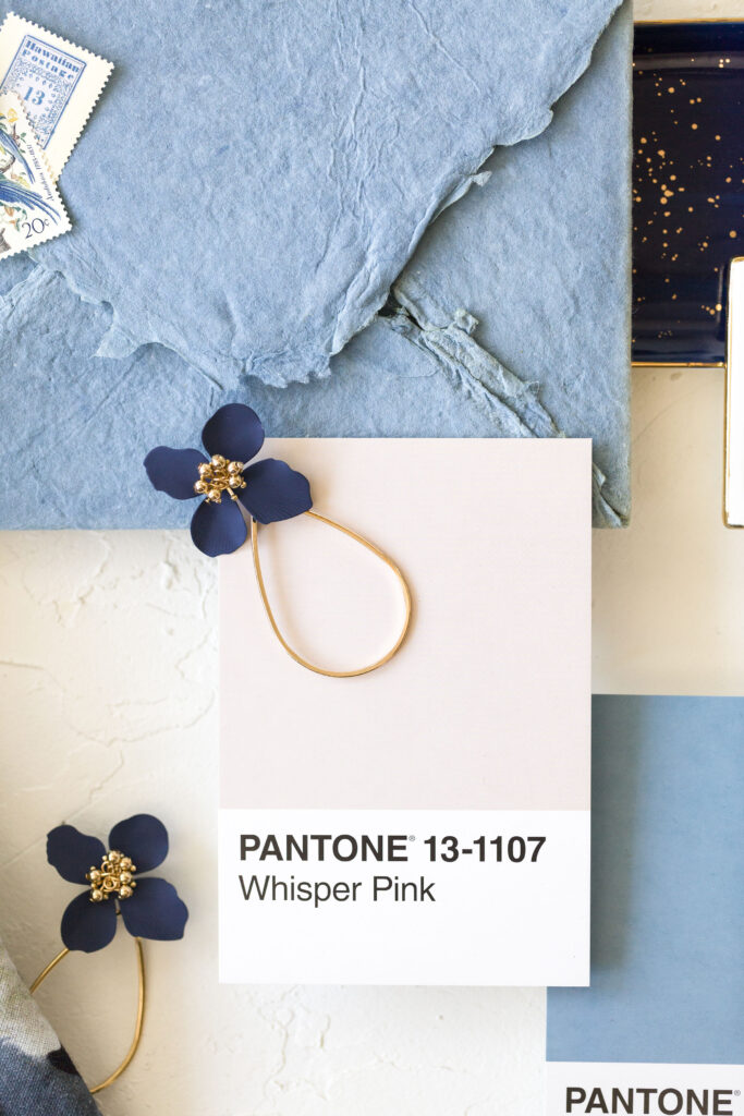
Effortlessly romantic with a cool, modern edge
This palette blends softness and sophistication. Whisper Pink brings femininity and calm. Faded Denim adds contrast and modernity. It’s a dreamy option for couples who love the idea of a classic color palette, but want it to feel updated and unexpected.
Use it in: pale pink stationery, blue silk ribbon, antique silver details, and soft thistle accents in your florals.
3. Pantone Morning Mist + Peach Pearl
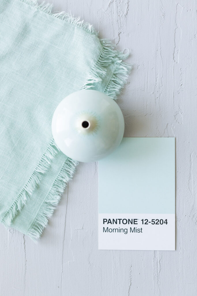
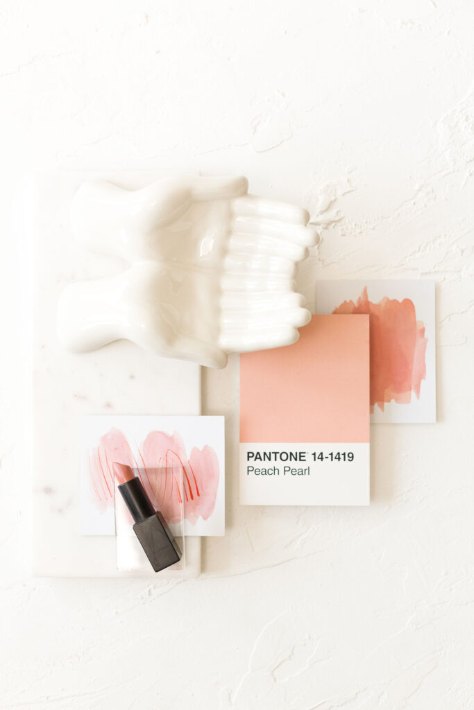
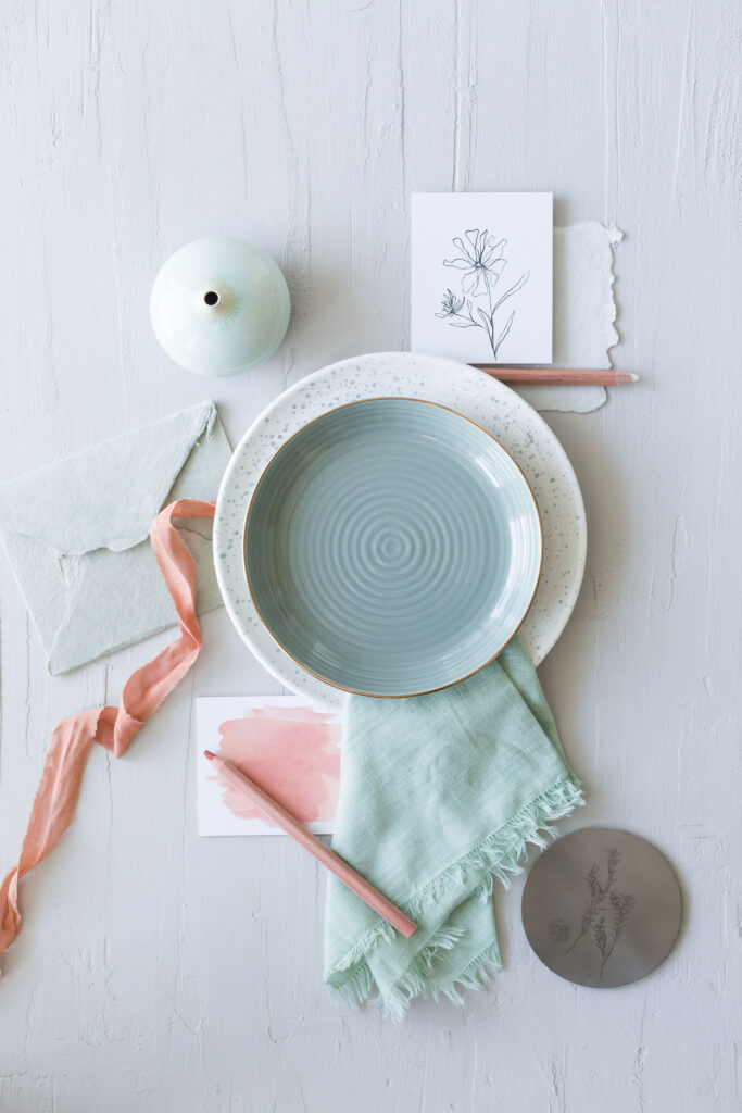
Delicate, light-filled, and full of grace
If you’re planning a minimalist wedding with an ethereal feel, Morning Mist and Peach Pearl are your go-to. This color story feels clean, calming, and quietly luxurious – ideal for an elevated, neutral-based spring wedding color palette.
Use it in: vellum overlays, cream-toned roses, peach stock, and sculptural floral arrangements with a soft, diffused aesthetic.
4. Pantone Desert Sand + Picante
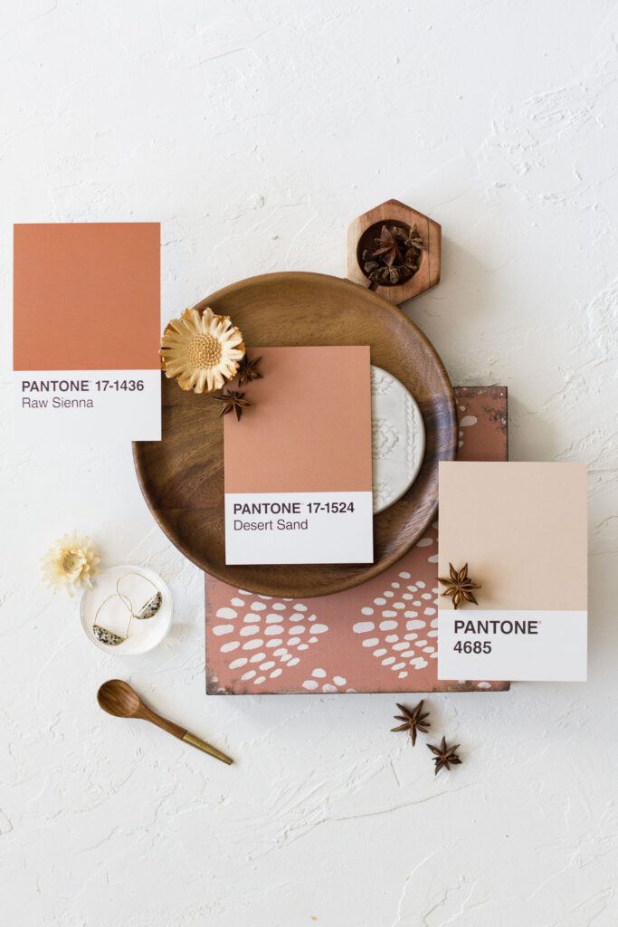
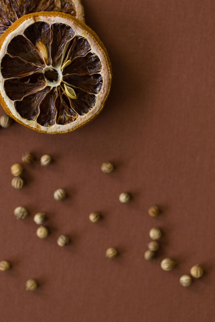
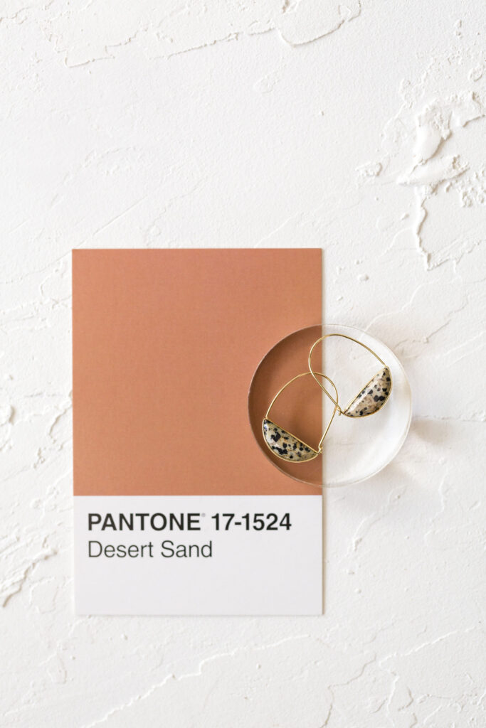
Neutral meets spice: for couples who want warmth with edge
Desert Sand is understated and natural. Picante introduces heat and contrast. Together, they create a palette that feels grounded and editorial. It’s a sophisticated twist on the boho aesthetic, perfect for spring celebrations with personality.
Use it in: terracotta vessels, rust-toned orchids, hand-torn menus, and candlelight with soft flickers of amber and cinnamon.
5. Pantone Tigerlily + 9241
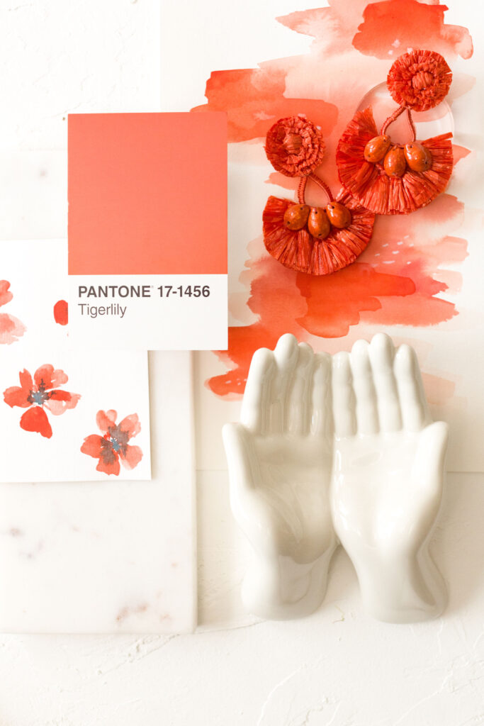
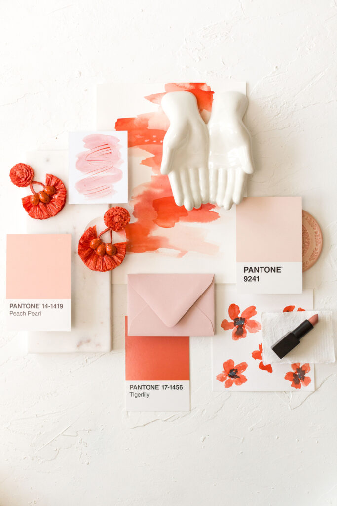
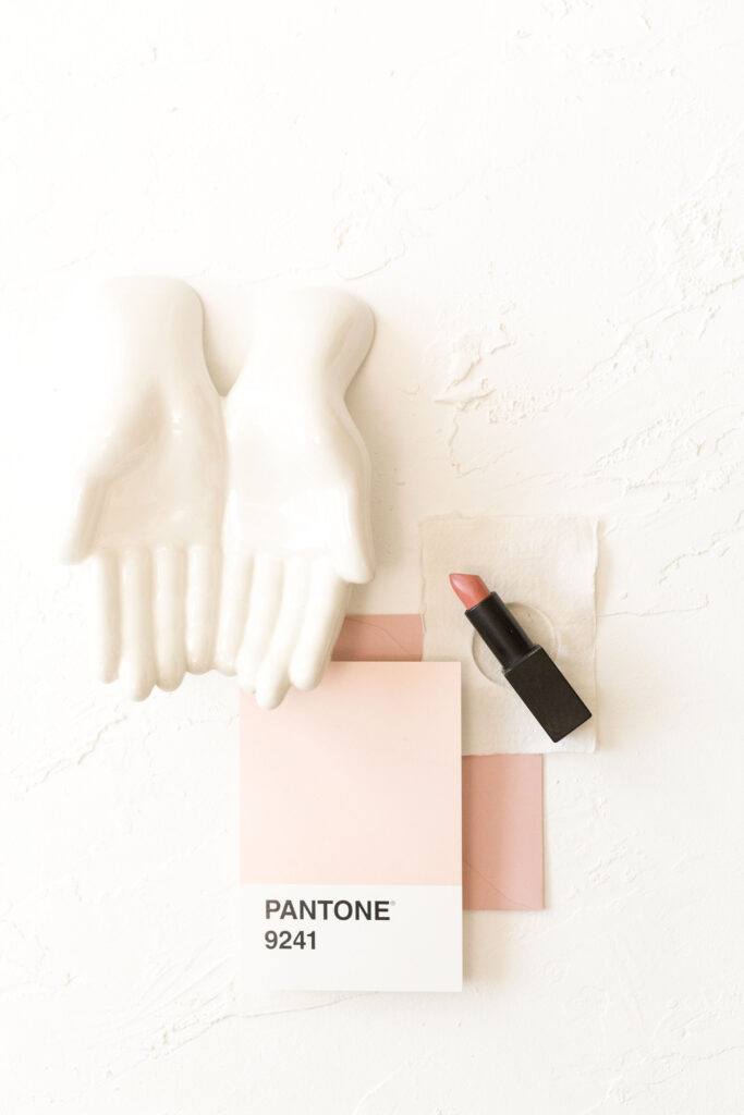
Bold, bright, and full of creative energy
Tigerlily is punchy and fun. 9241 anchors the palette with a grounding tone. This duo is perfect for couples who want their wedding to feel expressive and one-of-a-kind. It’s a more daring take on a traditional spring wedding color palette, and it makes a big visual impact.
Use it in: statement floral arches, layered signage, watercolor accents, and mixed glassware that adds vibrancy and charm.
6. Pantone Picante + Winter Wheat

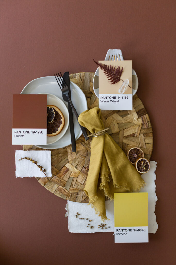
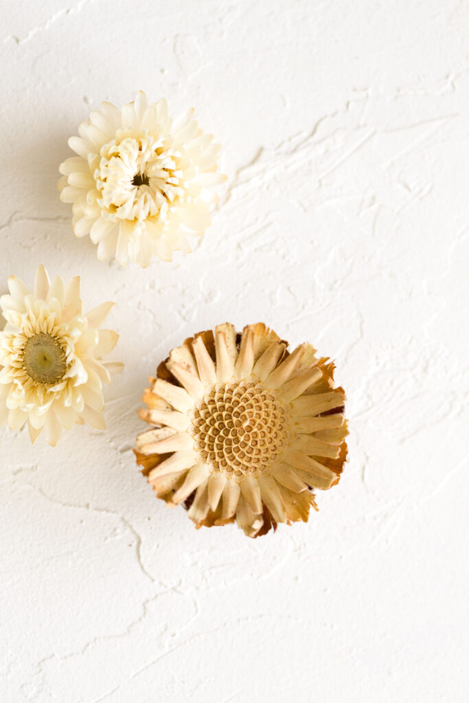
Earthy, elevated, and completely timeless
This palette is rich in texture and tone. Picante brings depth and richness, while Winter Wheat keeps the overall look soft and airy. If you want a color scheme that feels cozy but refined, this one is your match.
Use it in: linen tablecloths, handmade ceramics, wax-sealed invitations, and centerpieces filled with cream roses and rust-hued foliage.
7. Pantone Deep Cobalt + Whisper Pink
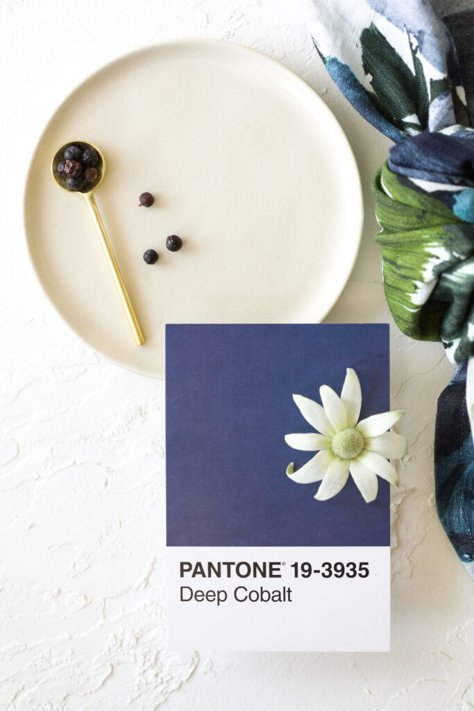
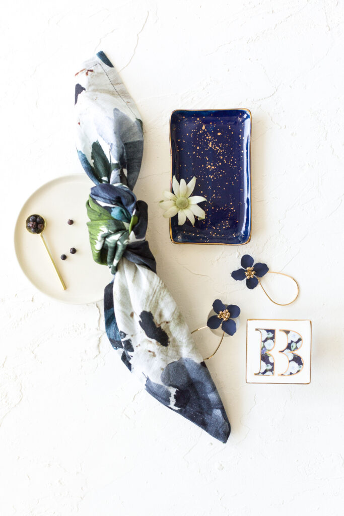
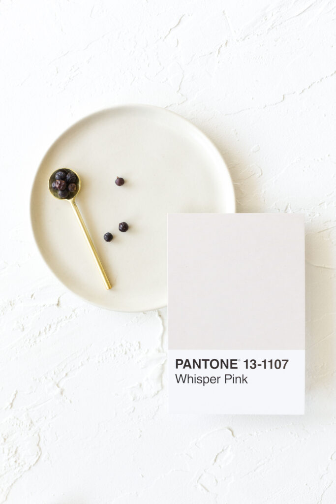
Bold meets soft in this poetic, unforgettable pairing
Deep Cobalt offers drama and contrast. Whisper Pink softens the edges. This is the kind of palette that photographs beautifully and feels intimate. It’s ideal for evening receptions or candlelit spring venues.
Use it in: velvet runners, gold-rimmed dinnerware, pale florals with navy accents, and refined paper goods with metallic finishes.
How to Bring Your Color Palette Into Every Detail
Once you’ve chosen your spring wedding color palette, it becomes the foundation for every detail. Here’s how to weave it into your celebration:
- Reflect it in your invitations, from envelope liners to ink colors and wax seals.
- Infuse your tablescape with complementary linens, chargers, napkins, and candlelight.
- Let your florals echo your palette in both tone and texture.
- Share your palette with your planner, florist, and photographer to keep everything visually cohesive.
And don’t forget to build a mood board. Gather swatches, photos, and samples to help your team visualize your style. It makes every design decision easier and ensures your day feels beautifully intentional.
Get inspired by these real spring weddings:
Looking for a Charleston wedding photographer to capture your big day?
+ COMMENTS
add a comment